Brand arrow
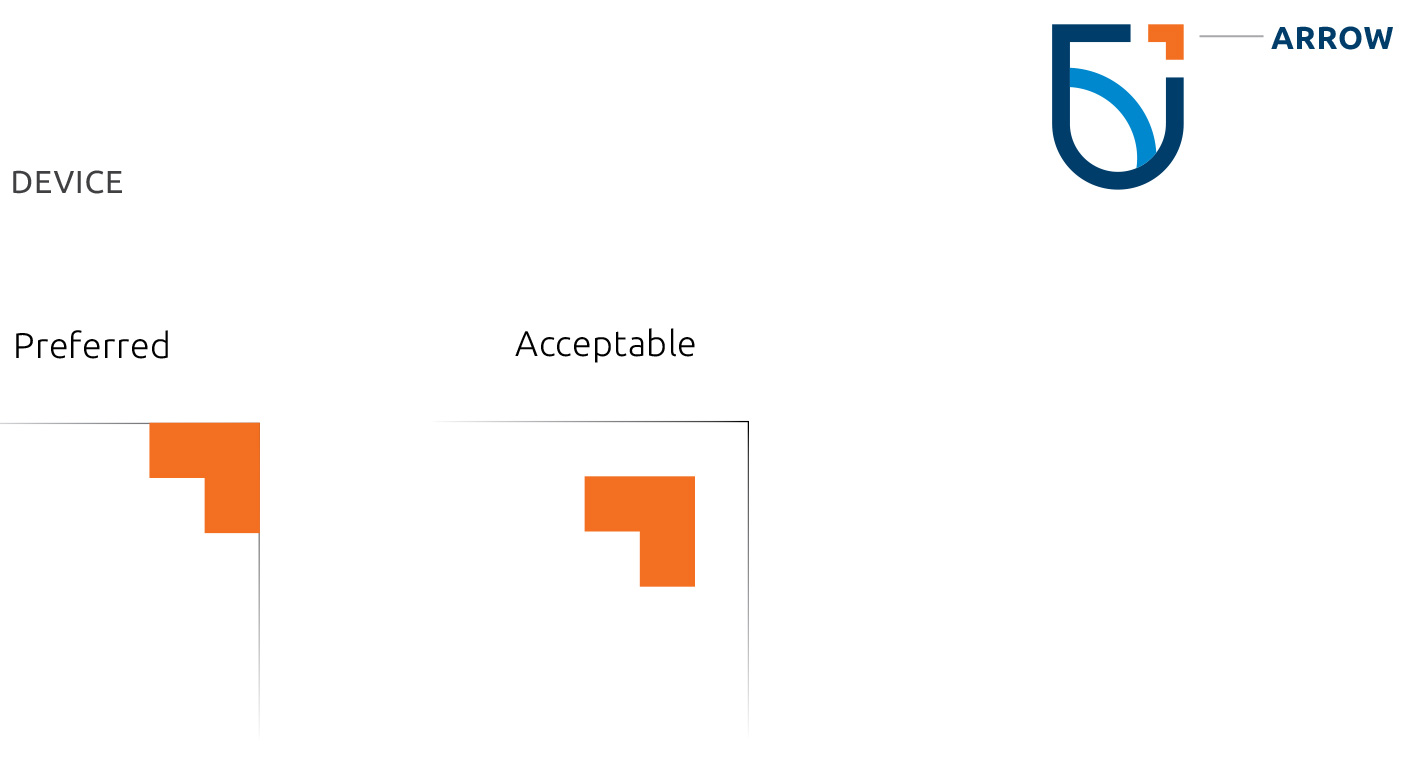
You can use the brand arrow on its own, across brand applications to bring visual impact or structure to the layout. In order to maintain consistency and balance, it must be used carefully.

Best practices
- The arrow must always be used in 100 per cent Tech Tangerine.
- Use of the arrow is preferred to be flush to the edge of the document, not inset.
- Ensure the arrow isn’t overused within a layout.
- Proportion and clear space is important to make sure the device is not crowded or adding to visual clutter.
- Where possible, the arrow should point to the top right to reinforce forward direction.
Arrow pattern
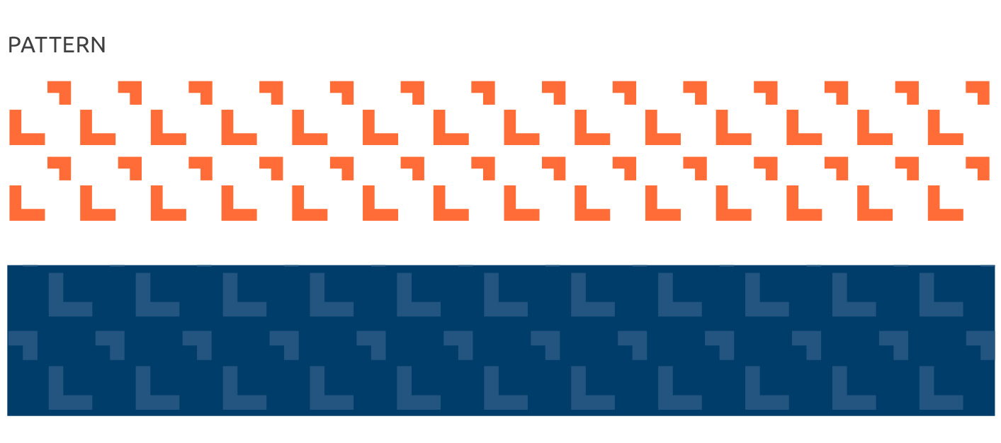
One of our brand patterns is created from the arrow.
The arrow brand pattern has the flexibility to change to other colours or be used monochromatically as tone-on-tone, as opposed to the arrow above, which should stay 100 per cent Tech Tangerine.

Arrow frame
The arrow frame can highlight content contained within the frame. There should be generous white space around the frame, and there shouldn’t be too much content. i.e. short, punchy facts where both corners of the frame are not too far apart from one another. The arrow frame is helpful as a typographic tool such as highlighting big-number callouts.

Arrow extension
The arrow can be used as positive or negative space to mask images.
Ensure there’s generous uncluttered space around the image frame. Avoid placing text too close.
It can be extended as an opening pull-quote. Ensure there’s generous uncluttered space around the pull-quote.
Note: The pull-quote can be used in any of our primary or secondary colours.

Incorrect usage
Here are examples of how our arrow shouldn’t be used. If you have any questions about how to apply the arrow contact brand@ontariotechu.ca.
Where possible, the arrow should point to the top right to reinforce forward direction. On its side as an arrow is also acceptable.

