Banner images
A banner is an image or video that appears at the top of a page, below the main navigation menu. Note that banner videos must be approved by Communications and Marketing due to layout, content and file size requirements.
Banner images are optimized for mobile devices—different size images are loaded depending on the device being used to decrease page load time and bandwidth use. Banner images should be requested and created by Communications and Marketing because of specific size, resolution, and layout constraints. Submit a Project Initiation form to request banner images.
For your reference, recommended banner image dimensions are as follows:
| Small screens (phones) | 1024px W x 320px H |
| Medium screens (tablets) | 1440px W x 450px H |
| Large screens (computers) | 1920px W x 600px H |
Note that the banner height can be adjusted if necessary, but the width should be set as listed above.
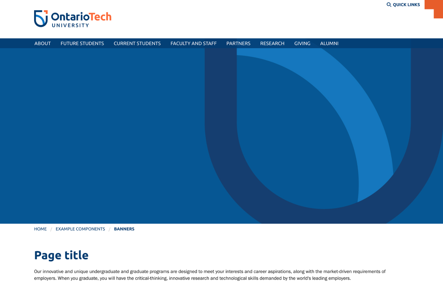
The banner component can be placed on any page. The examples below show the various layout options.
-
Image/video only
Note that banner videos must be approved by Commuications and Marketing due to layout, content and file size requirements.
-
Caption box
A caption box can be displayed on top of the image and can include a heading, description, and/or a call-to-action link.

The caption box background colour can be specified. The default is dark blue. Orange is shown below.

-
Caption box with banner fade
The bottom of the banner image can be faded to blend into the main page content.

-
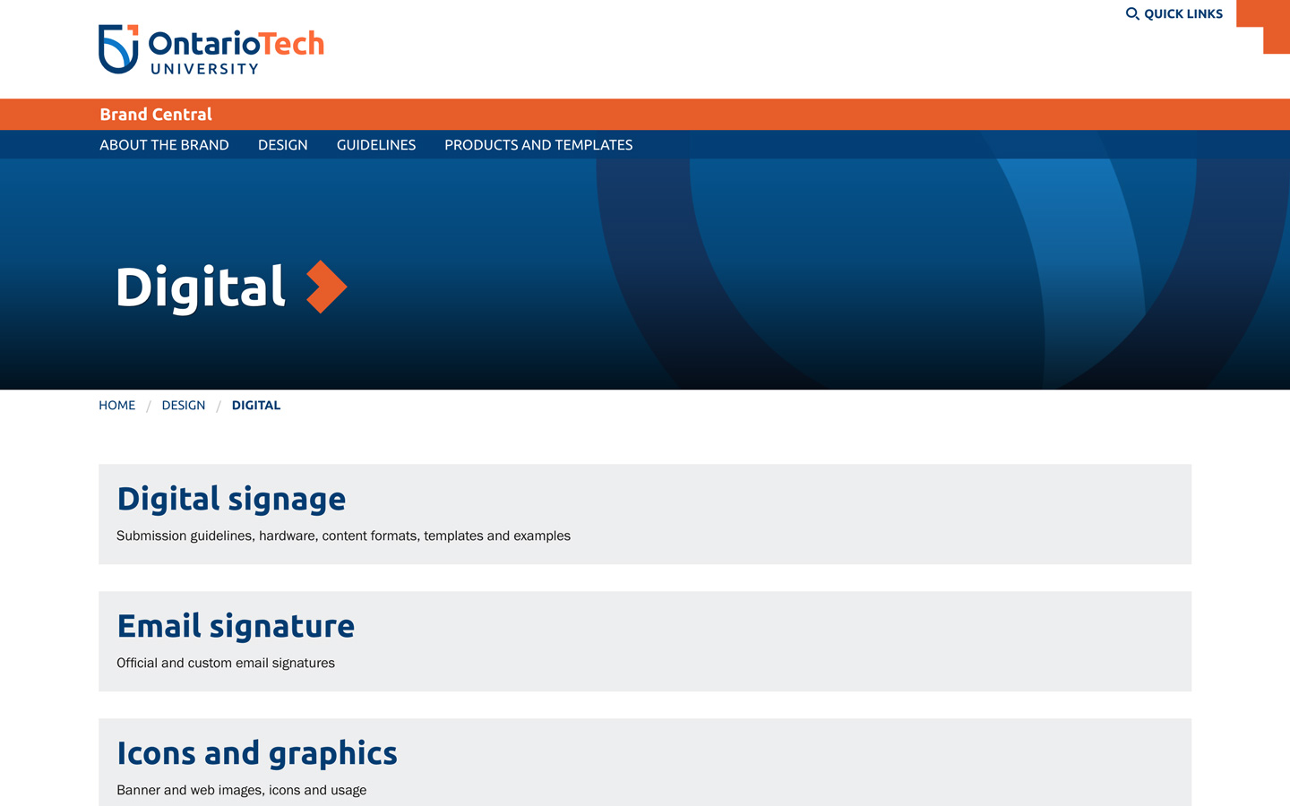
Text overlay
A caption can be displayed on top of the banner image and can include a heading, description, and/or a call-to-action link.
Images/video used in the text overlay layout should not be busy or have highly detailed content for accessibility. Simple, graphic treatments and darker images work best for legibility.

Text overlay headings can include a brand arrow. In most cases, the brand arrow should be placed after the heading (on the right). For example, when the banner has a call-to-action or when on an internal page.
Internal page banner:
The brand arrow should only be placed on the left for site title banners on home pages.
Microsite home page with banner text as site title:

-
Content overlay
The page content overlaps the banner image in the content overlay option.
Images used in the content overlay layout should not have important information within the bottom two-thirds of the image (such as someone's face). Graphic treatments work best for this layout.

Faculty home pages
-
Faculty home page banner and CTA thumbnails
Faculty home pages have a different banner layout. A large feature image is on the left and smaller call-to-action (CTA) thumbnails are stacked on the right.

Banner and CTA thumbnail image dimensions for faculty home pages are as follows:
Screen size Dimensions Large feature image Small screens (phones) 1000px W x 667px H Medium screens (tablets) 1440px W x 960px H Large screens (desktop) 1440px W x 960px H CTA thumbnails N/A 1000px W x 667px H Note that the image heights can be adjusted, however, the displayed size of each CTA thumbnail depends on the height of the large feature banner image. The CTA thumbnails will expand or shrink to fill the available vertical space based on the height of the large feature banner image.
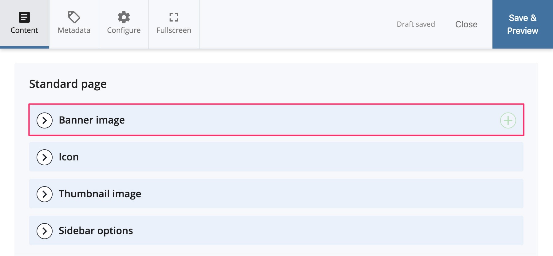
Add a banner image to a page
- Find an image in the Asset Library or upload your own banner image to the Shared Assets website in the CMS.
- On your website, edit the page or create a new page on which you want the banner image.
- Expand the Banner image section.
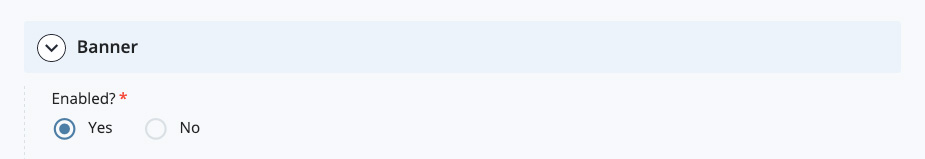
- Set the Enabled? option to Yes.
- Select the Content type—either Image, Video, or Banner block.

- Note: Videos must be approved by Communications and Marketing due to layout, content and file size requirements. Videos should be uploaded to our Vimeo account. Contact us regarding video banners.
- The Banner block option is another way of adding a banner to a page. This option is useful if you want to reuse the same banner on multiple pages, or if you need to keep past banners archived and easily searchable. Contact us if you wish to use this method.
- You can include different size images for each screen size to optimize the experience for users. The first, default option is required; the largest image size should be used here. For each size option, browse to and select the appropriate image version in the CMS.

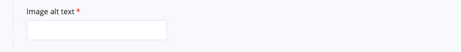
- Enter the Image alt text (a concise description of the image).
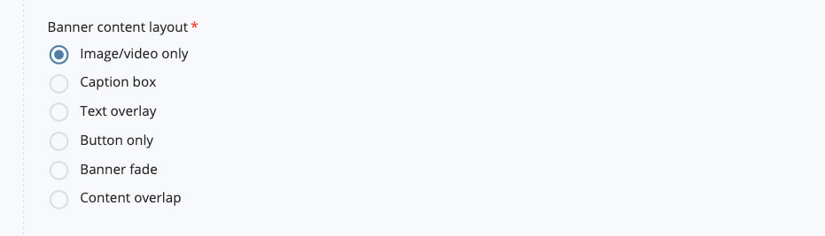
- If you'd like to include text content with the banner, select a Banner content layout option. The default option of Image/video only shows a standard banner image or video. Refer to the examples at the top of this page to preview the available options.
Note that the editor will not show a preview of the image, only the path to the image. You can preview the image by updating your draft and viewing the page before submitting it to the workflow.