Tabs
Tabs is a page component consisting of clickable headings (tabs) that control the visibility of sections of content. Clicking on a tab heading will show the content associated with that heading.
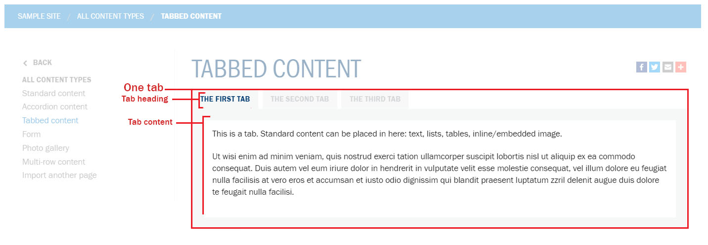
Be mindful of the number of tabs in a group; tabs should not exceed a single row on desktop screen sizes (on smaller/mobile devices, the tab layout automatically change to an accordion display). If you have several tabs or the titles of the tabs are long, causing the tab titles to exceed a single row, use vertical tabs or accordions instead. If you must have more tabs, consider using instead, or splitting the content into multiple pages.
Example of incorrect usage (too many tabs):

How to
Create tabbed content
- Create a new page or edit an existing page.
-
If you're using the Standard page template: in the Content type section of the page editor, select the Tabbed content option.
Standard page template 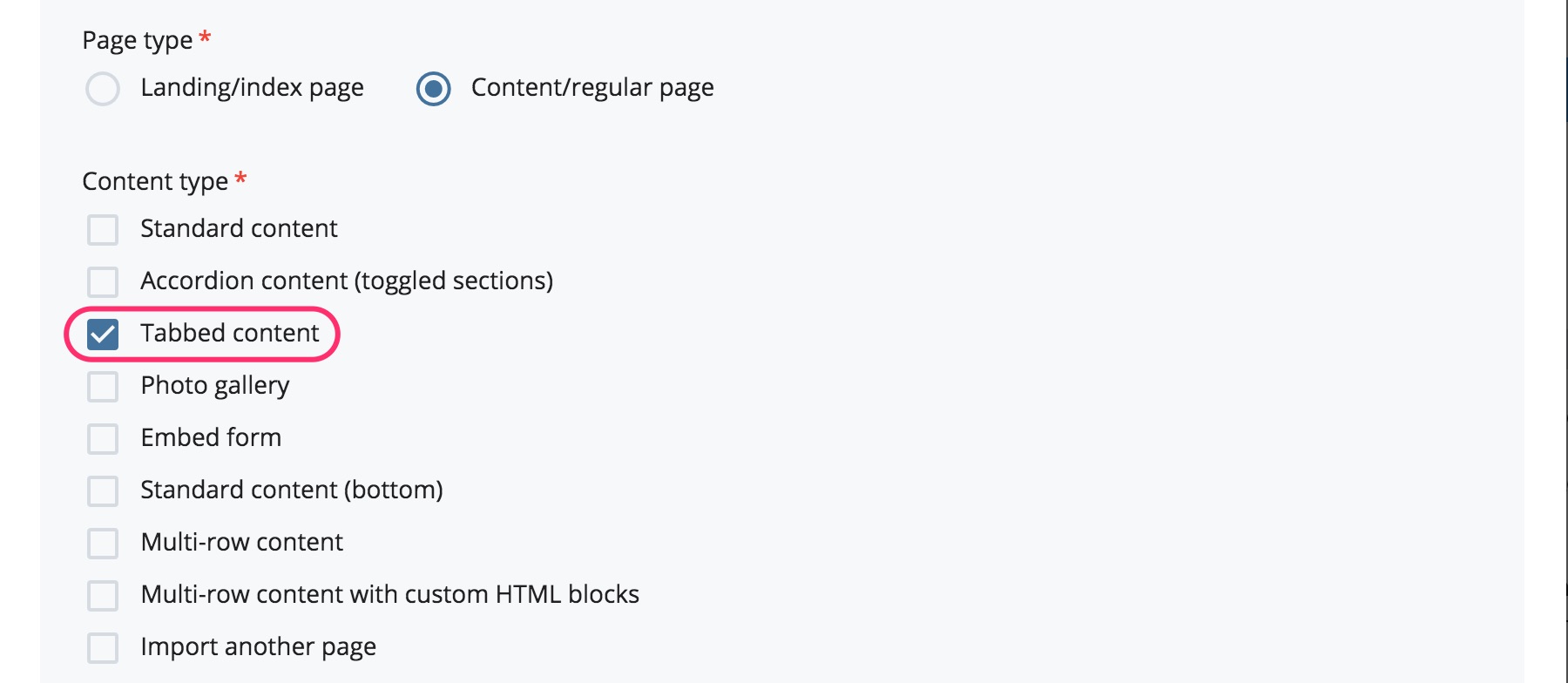
If you're using the Global page template: in the current Section, select the Tabs option from the Component dropdown.
Global page template 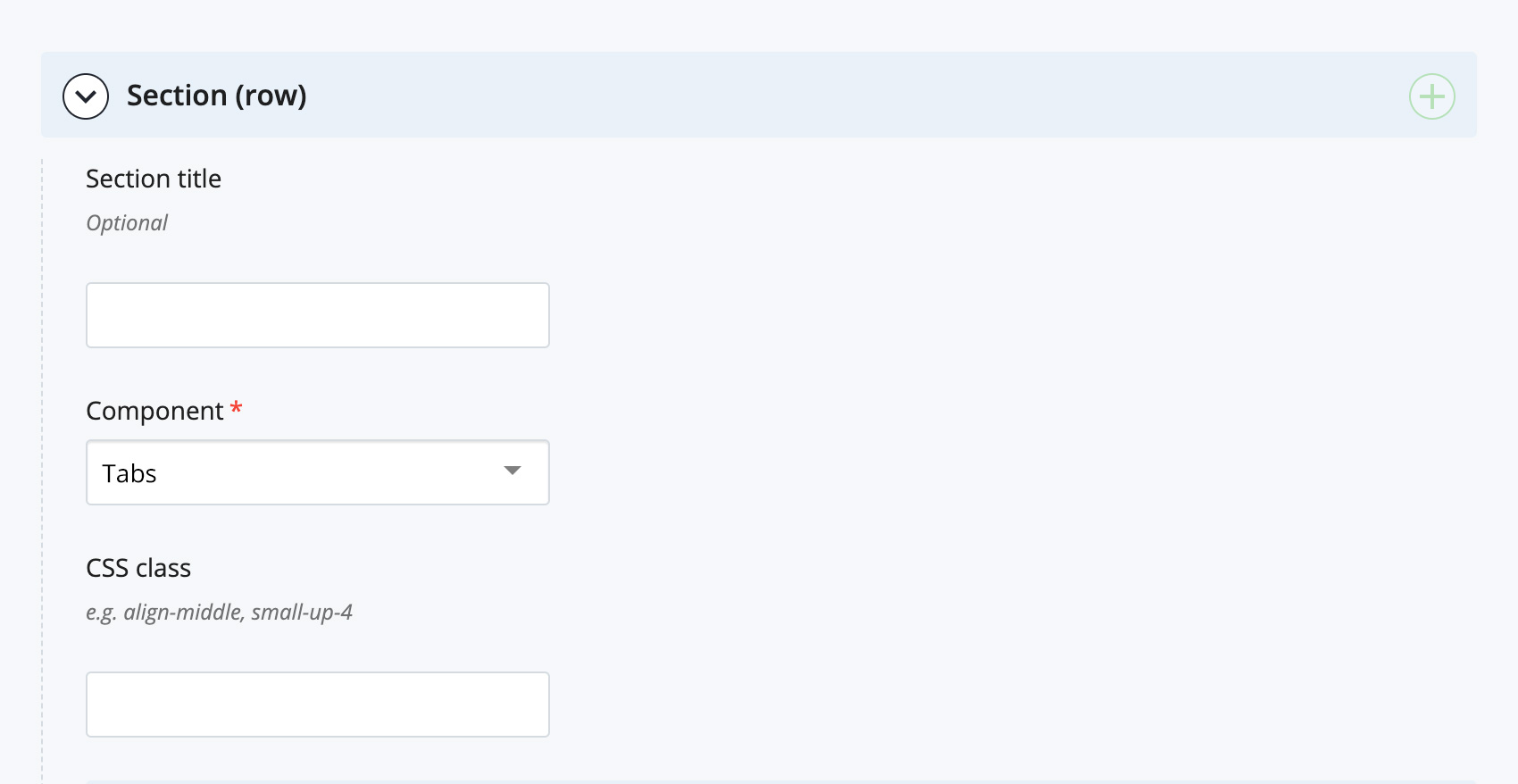
The tab editor will appear.
- Enter the first tab heading in the Tab title field and the content for that tab in the Tab content WYSIWYG editor (or content editor) - pronounced WIZ-ee-wig; an acronym for 'what you see is what you get'. A type of content editor similar to a word processor that allows you to format and preview page content..
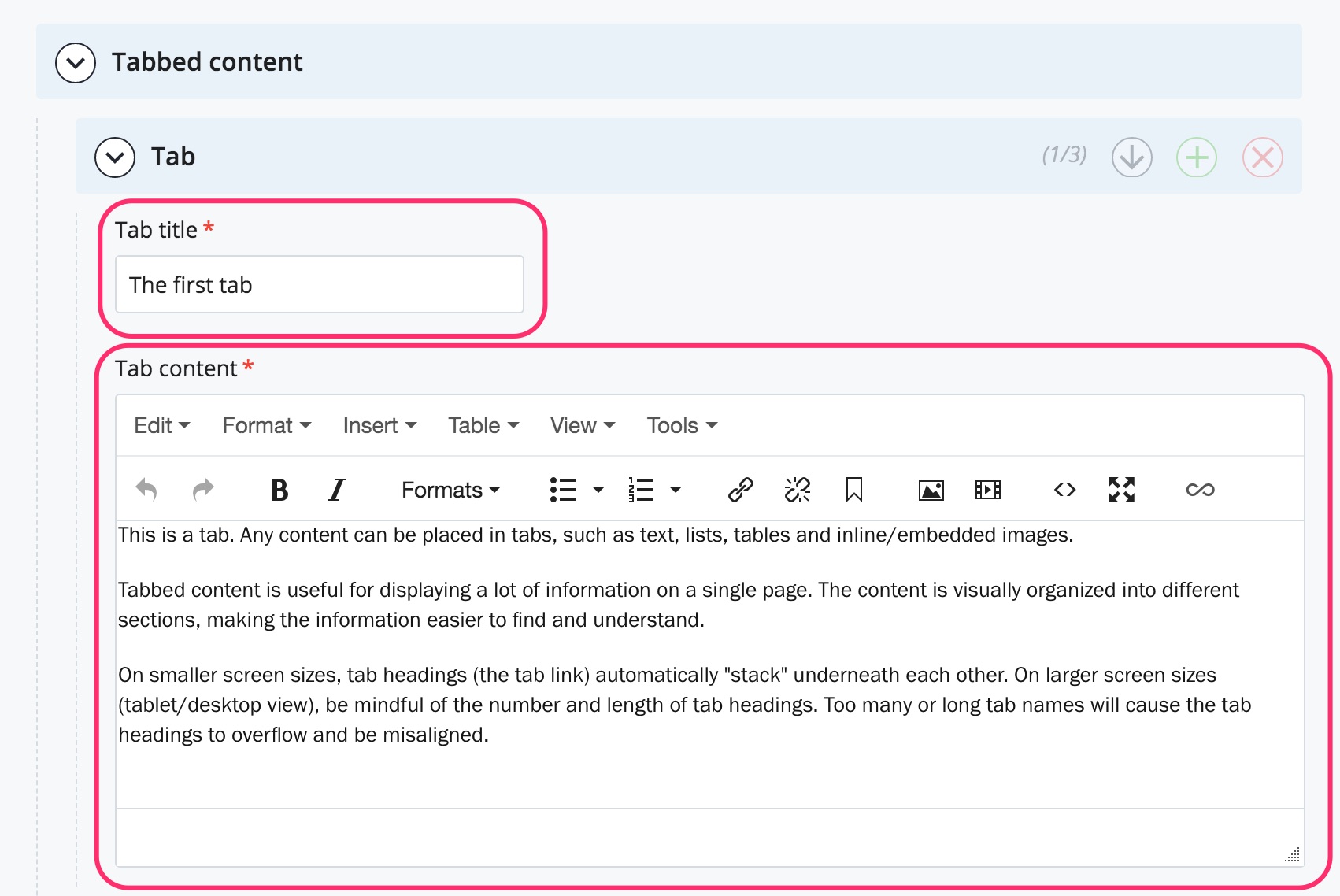
- To create another tab, click the green + icon in the Tab section label. Another tab section will appear after the current tab section. Continue adding tabs as required.
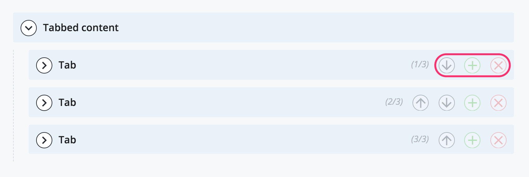
- You can reorder tabs by clicking on the arrows on each Tab section label. Delete a tab by clicking on the red x icon on each Tab section label.
Tip: expand and collapse individual tab editors as you are working in the page editor to minimize the visual clutter on the screen.