Card grid
Card grid is a page component that consists of a number of links to pages, displayed in a card format. Links, descriptions, and icons can be customized.
Each row can contain up to 5 cards (columns)—each will be evenly spaced across the page. On smaller screen sizes, the cards will automatically resize to fit in the available space.
Avoid using too many cards on a page; ~9 cards is the recommend limit. Too many elements that are visually similar are more difficult to scan and digest. Consider adding visual breaks and using different components instead.
Regular content, such as a heading, can be placed in between rows to act as a separator. In the example page below, a list of the used options appear between each card row.
- View an example of a card grid page and recommended combinations of options
- View examples of available icons
How to
Create cards
- Create a new page or edit an existing page.
-
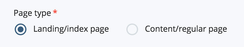
If you're using the Standard page template:
In the Page type section of the page editor, select the Landing/index page option.
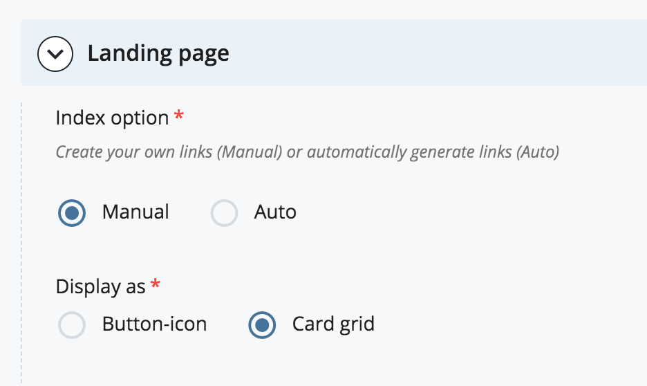
In the Index option section, select Manual.
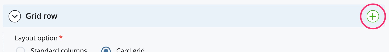
In the Layout option section, select Card grid. The Grid row editor will appear.
If you're using the Global page template:
In the current Section, select the Card grid option from the Component dropdown.
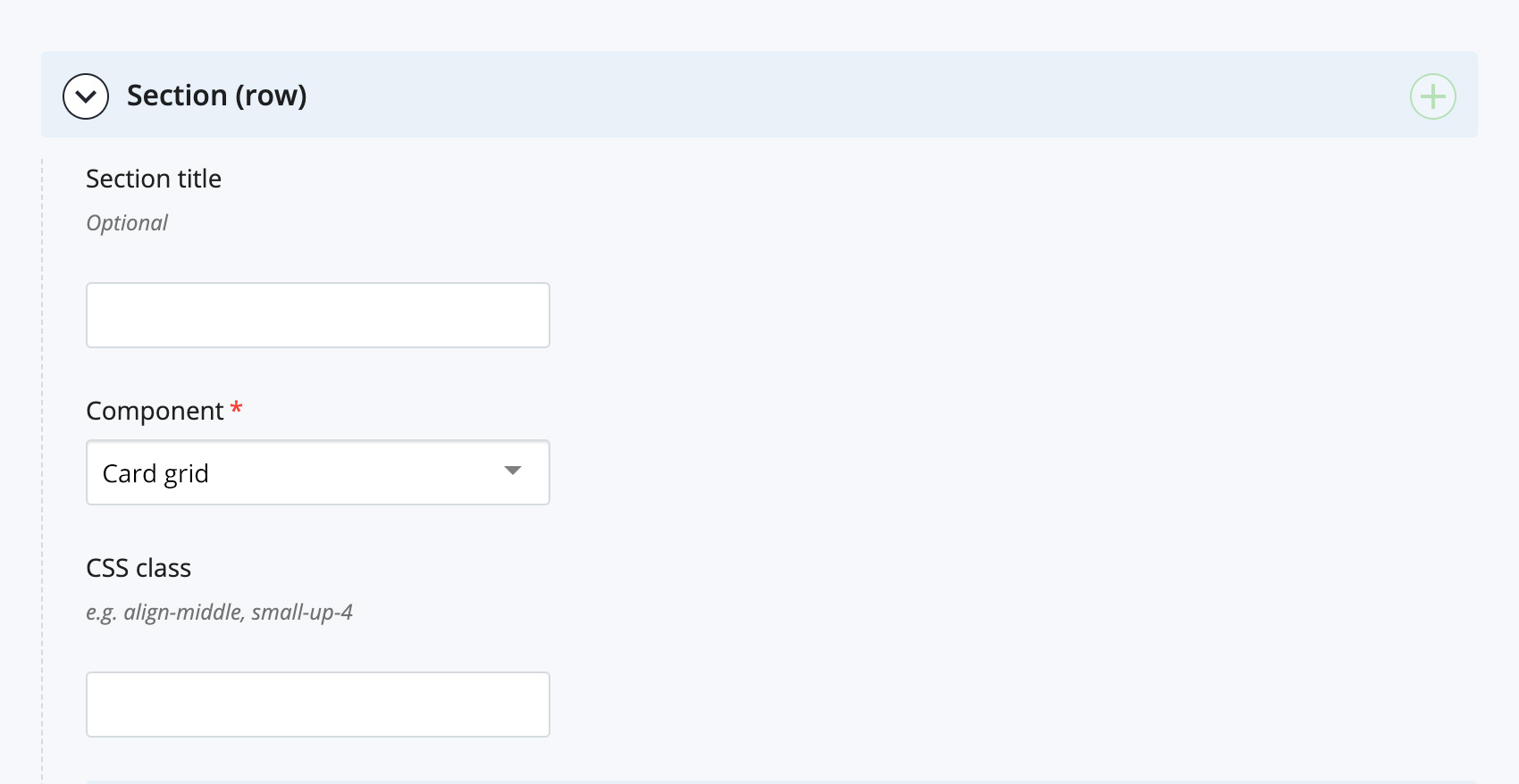
The card grid editor will appear.
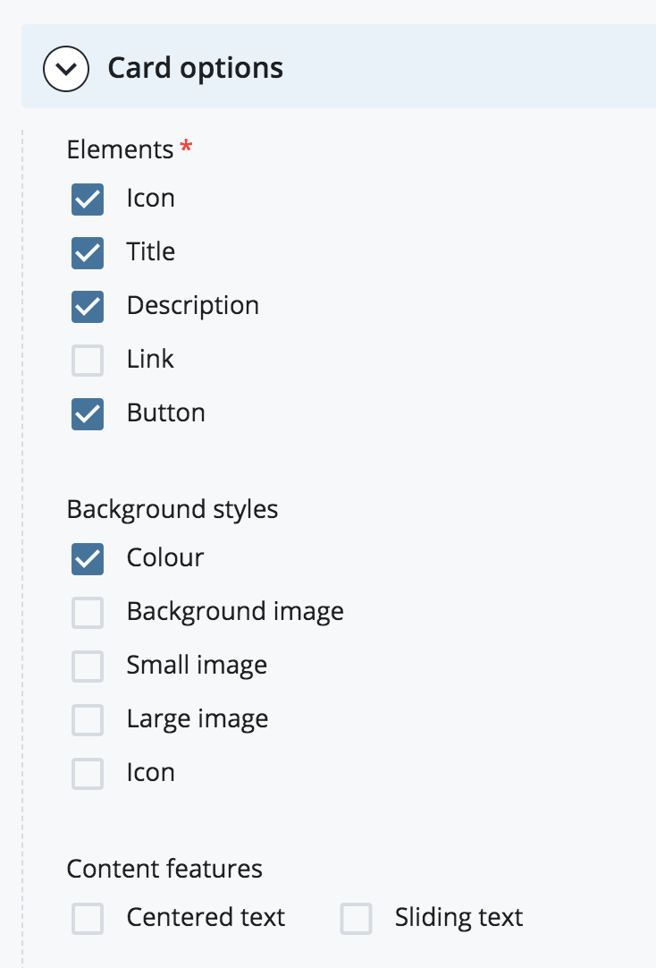
- In the Card options section, select the Elements and/or Background styles and/or Content features that you want for the cards in the current row. Note that the options will be the same for each card in the current row.
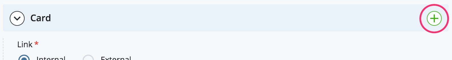
- If the Link element was chosen: in the Card section, select whether you want to link to an Internal CMS page or an external web page. Select the CMS page or enter the URL of the external page.
- If the Icon element was chosen: in the Card section, select the name of the icon you want to use. View examples of available icons.
- If the Title element was chosen: in the Card section, enter a title for the card.
- If the Description element was chosen: in the Card section, enter a brief description for the card.
- To create another card, select the green + icon in the Card section heading. Continue adding cards as required.
- To create another row of cards, select the green + icon in the Section or Grid row section heading. Continue adding rows as required.
If you're creating several cards and you'll have the same number of cards per row, you don't need to create a new CMS grid row/section for every single row to be displayed on the page. You can add all of the cards in a single CMS grid row/section and control the number of cards that get displayed per row using CSS classes. This makes it easier to add/remove cards later, without having to re-create or move any existing cards to a different row. Contact the Web Team for assistance with this.