Accordions
Accordions is a page component consisting of collapsible sections of content. Clicking on an accordion heading will show/hide (toggle) the content associated with the heading.
One accordion consists of a title and its content. Multiple accordions make up an accordion group. Multiple accordion groups can also be added to a page, separated by an optional heading.
How To
Create accordions
- Create a new page or edit an existing page.
-
If you're using the Standard page template: in the Content type section of the page editor, select the Accordion content (toggled sections) option.
Standard page template 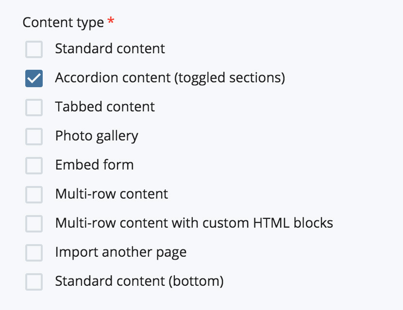
If you're using the Global page template: in the current Section, select the Accordions option from the Component dropdown.
Global page template 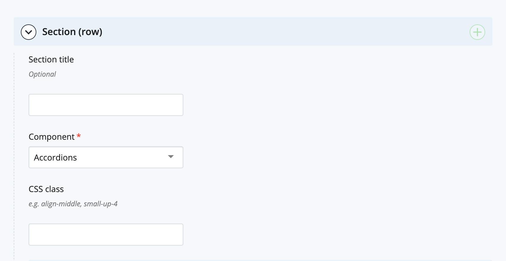
The accordion editor will appear.
- Accordion group settings:
- Optionally enter a heading in the Accordion group title field.
- If you want the first accordion in the group to be open (expanded) when the page is first loaded, set the Open first accordion by default option to Yes.
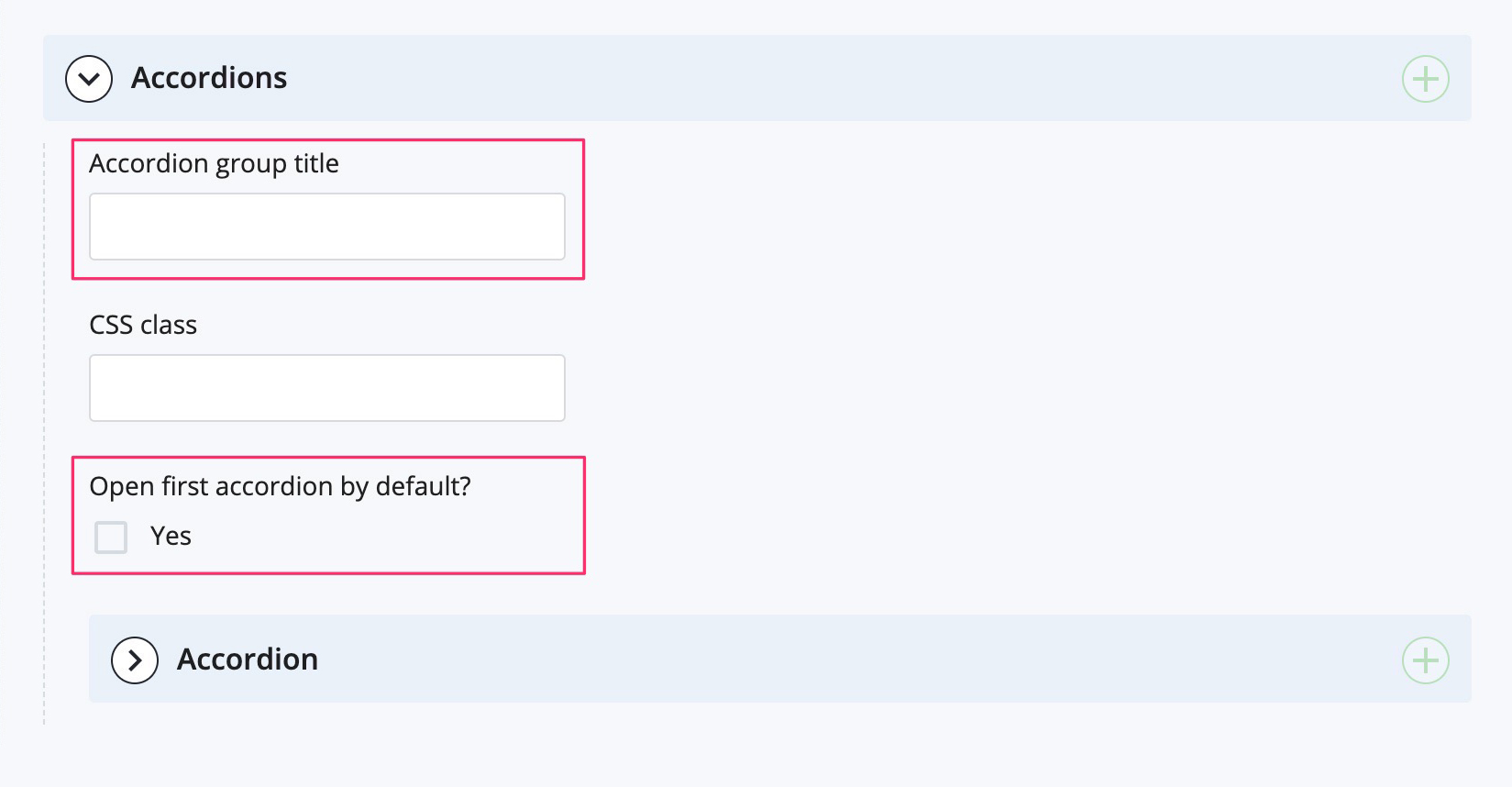
- Expand the Accordion section. Enter the first accordion title in the Accordion title field and the content for that accordion in the Accordion content WYSIWYG editor.
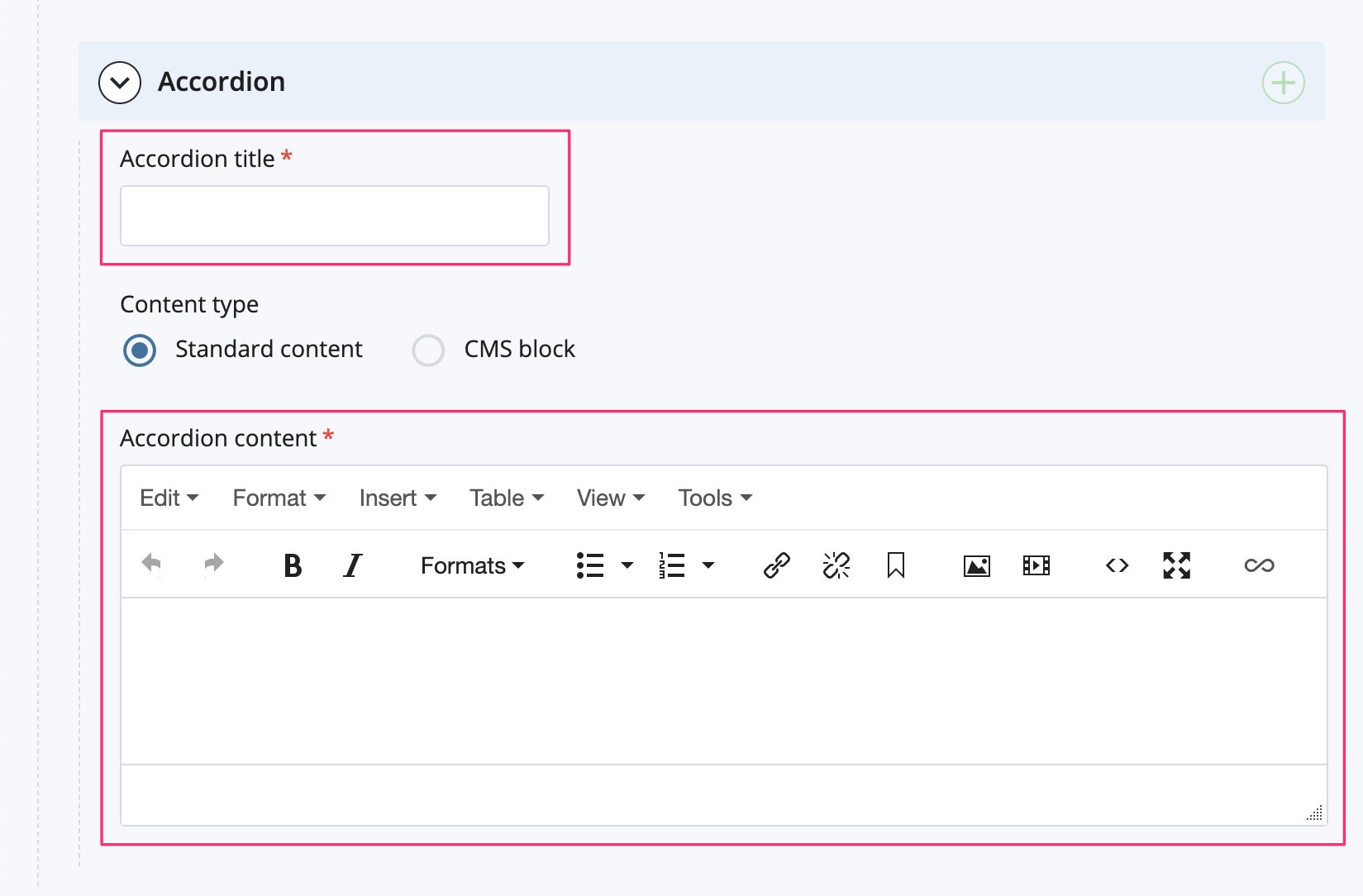
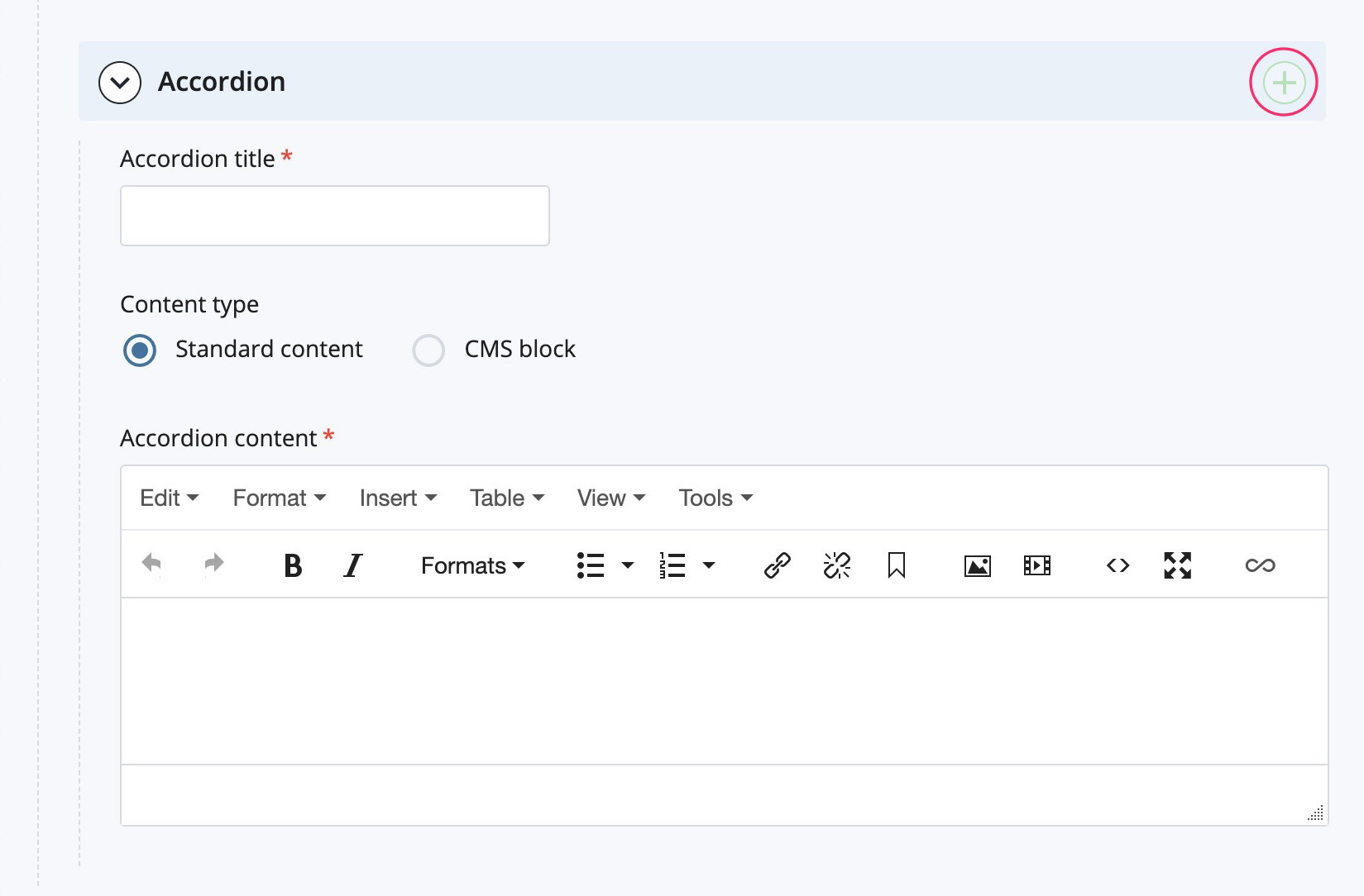
- To create additional accordions, click the green + icon in the Accordion section label. A new accordion section will appear after the current accordion section. Continue adding accordions as required.
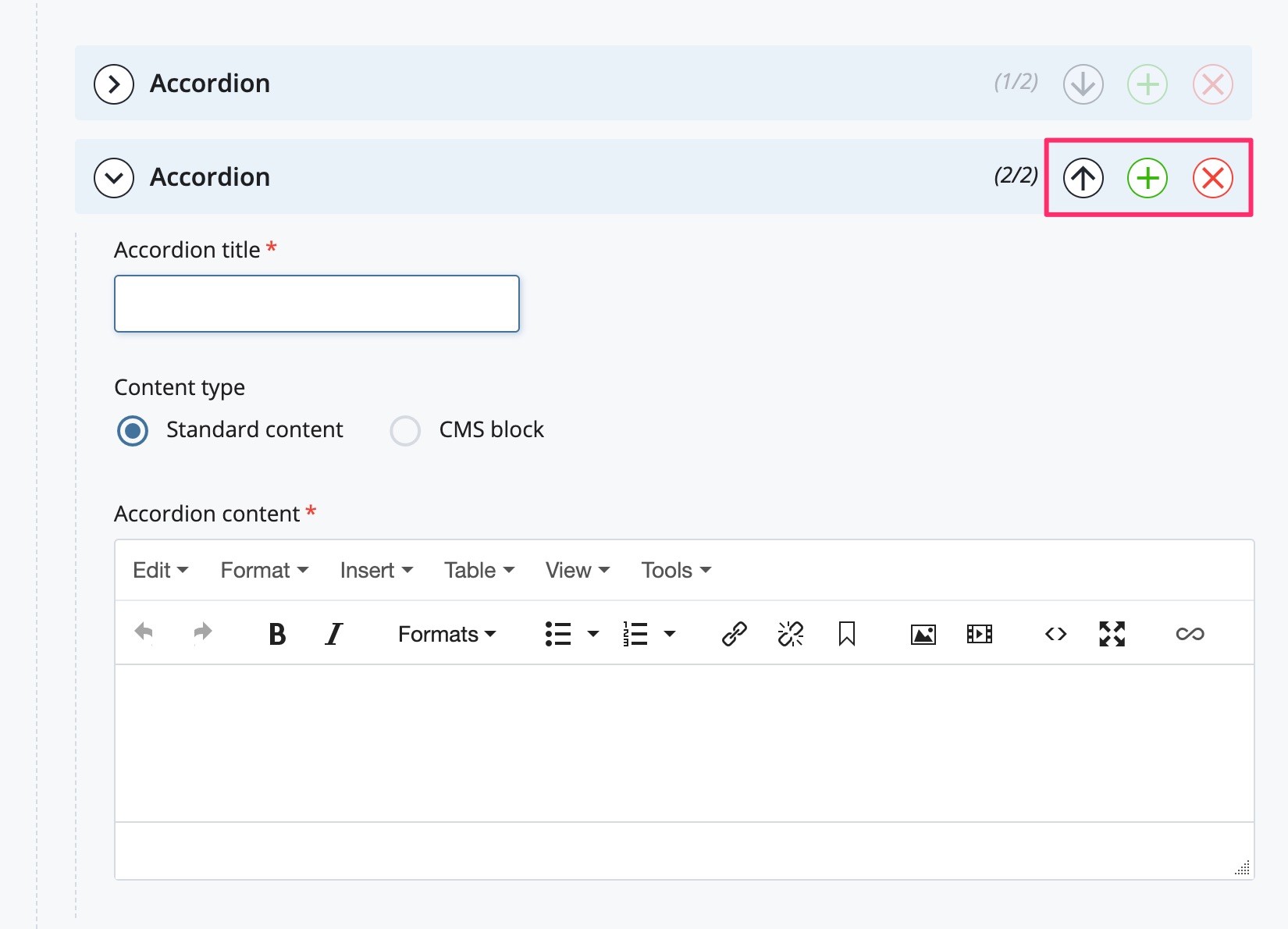
- You can reorder accordions by clicking on the arrows on each Accordion section label. Delete an accordion by clicking on the red x icon on each Accordion section label.
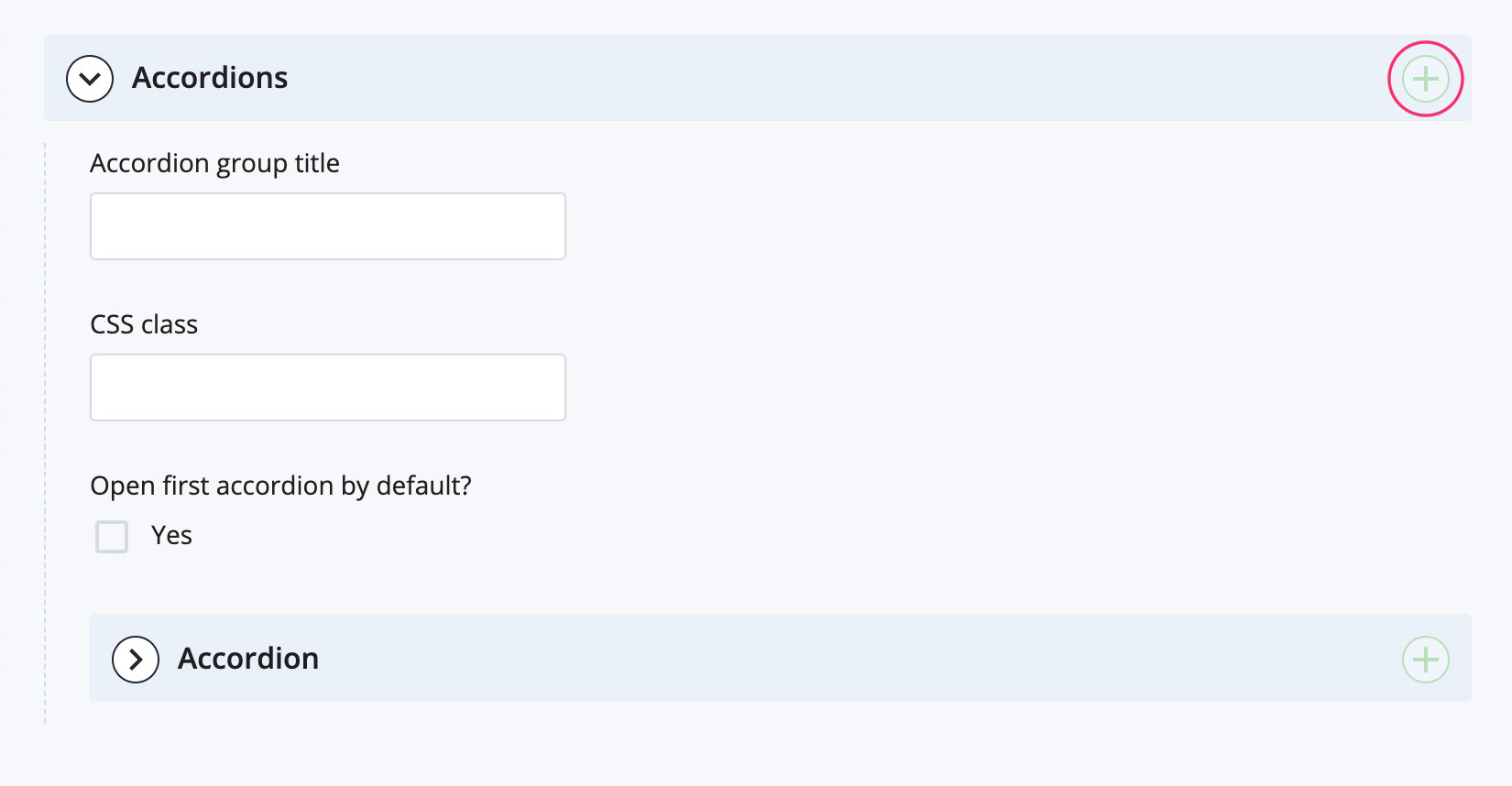
- If you want multiple accordion groups on a page, click the green + icon in the Accordion content (toggled sections) or Accordions section label. This will create another accordions group section. Add/delete/re-order accordion group sections as required.
Tip: expand and collapse individual accordion/accordion group sections as you are working in the page editor to minimize the visual clutter on the screen.